Sears PartsDirect Responsive Redesign
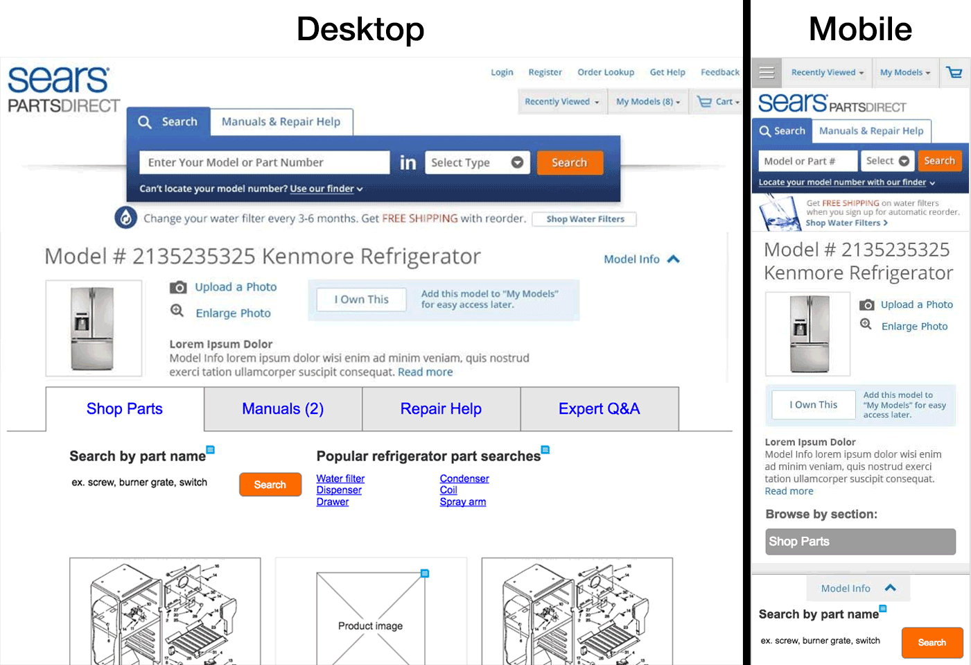
Some wire frames showing the desktop and mobile views of one page from Sears PartsDirect
The Problem
In 2013, Sears PartsDirect, Sears' website for buying replacement appliance parts, wasn't mobile-friendly. On top of that, the website was receiving a large amount of do-it-yourself repair guides.
So within a few months, a few things needed to happen:
- An entirely new informational section of the website needed to be created
- The new informational content and the existing pages where people buy replacement parts needed to link to each other when appropriate
- The entire website needed to be mobile-friendly
The Solution
Sears PartsDirect became one of the first websites at Sears Holdings (which has a lot of websites) to go responsive. I worked with a team of business stakeholders, two other information architects, and a local front-end development team.
The informational section of Sears PartsDirect directed users into the shopping section of the website, and users in the shopping section could access repair guides without losing their place in the shopping process.
The Process
I white boarded ideas with a small design team. We'd all been working on Sears PartsDirect for about a year at that point, so we were all intimately familiar with the website's search-based purchase flow. But, we wanted to make sure we'd had a chance to discuss the way page elements should behave before we started wire framing. We did this a couple times a week throughout the project.
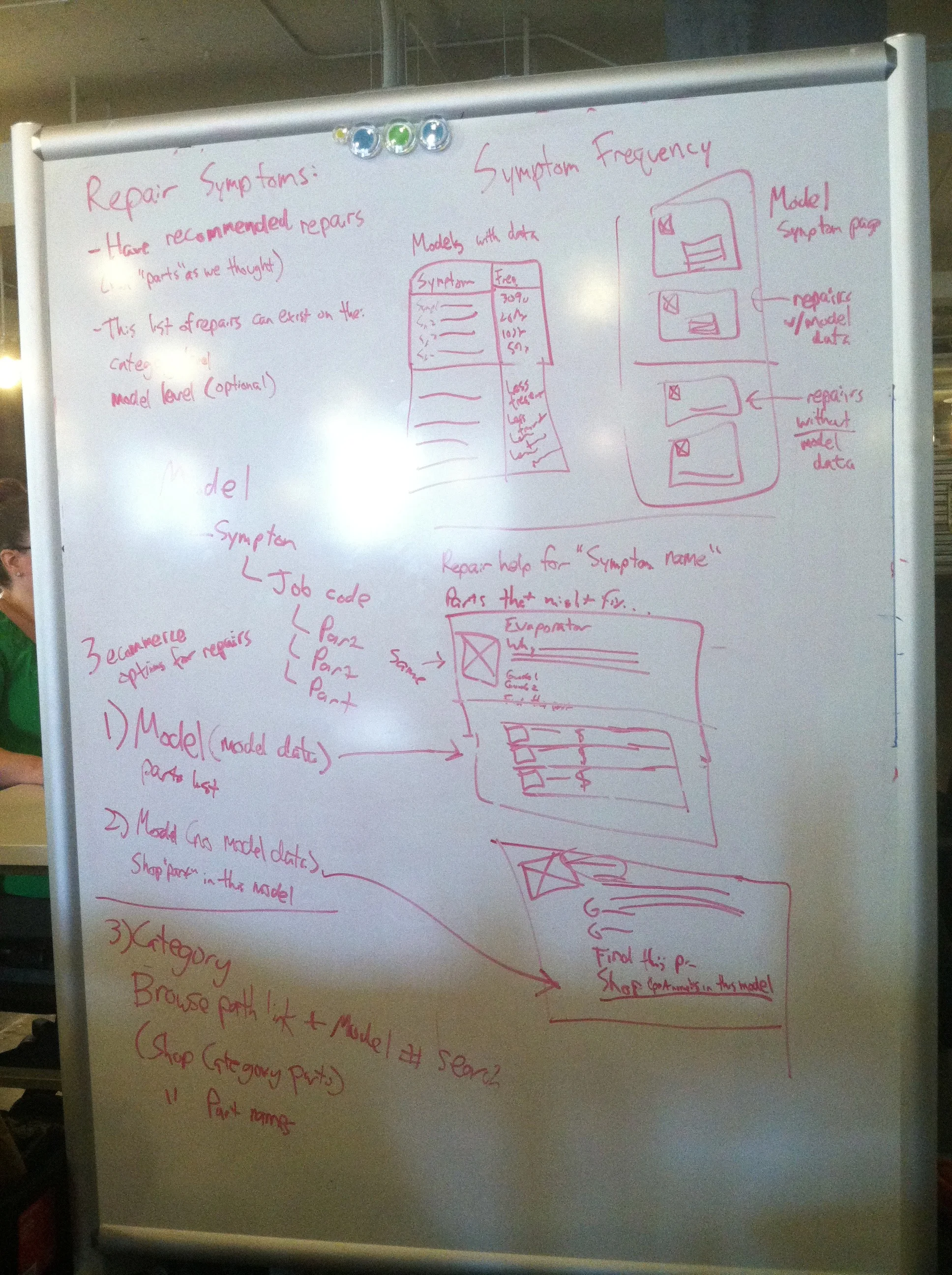
My handwriting's gotten better.
I wire framed all page templates in at least three views. I shared a collaborative project file in Axure with my team so we could share assets, and all templates were shown in at least three views: mobile, tablet, and desktop.
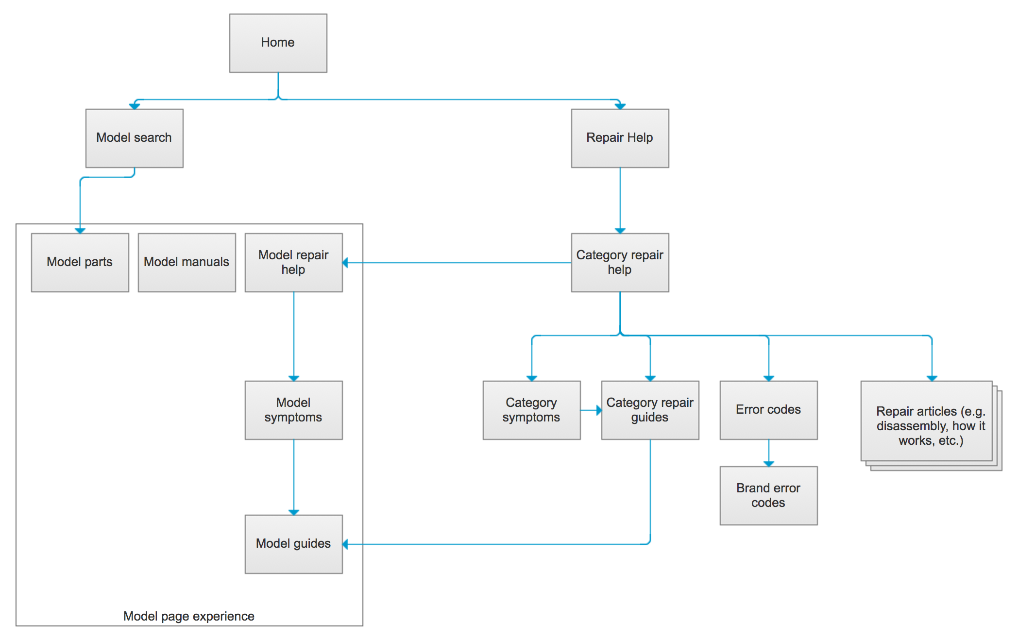
I made a site map to help contextualize how all the new pages connected to the current content. It was important that the design team and the product team understood how the new section of the website connected to the current one.
I added detailed annotations to all new page templates. All new page templates were going to be powered by an upcoming CMS, so every page element had to be tagged and explained so that it could be added to that CMS. That meant defining content types and character limits.
I checked in with the content team to make sure our page designs worked for them. It's almost always best to design with actual content in mind, but we didn't have that luxury. We were designing page templates for content that hadn't been finished yet, so I checked in with the content team and making sure our assumptions about content weren't way off. (e.g. "Is it safe to assume most repair articles will be in the form of a step-by-step list?", "Is it appropriate to describe repairs in terms of how long it takes to complete them?")
I worked closely with our front-end development team. At the end of the day, a responsive redesign hinges largely on the code that gets implemented. Thankfully, I worked with a great front-end development team. We checked in a couple times a week and talked through any issues that came up, right up until launch day.